Thornbury

(Design breakdown)Hospitality

KIYO 清

An ordering flow has one job: get someone from hungry to checked-out in as few taps as the thumb allows.

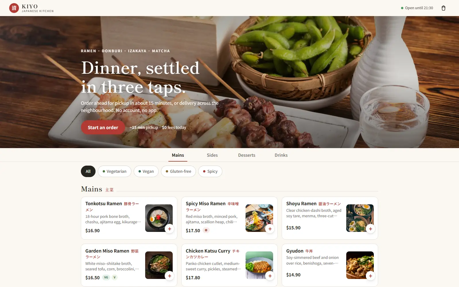
The KIYO homepage: 'Dinner, settled in three taps' over a wooden table of Japanese dishes, with a live menu board below.
002

KIYO 清

2026

Ordering / Mobile-first

A Japanese kitchen where the site is the ordering flow — thirty dishes, dietary filters, modifier drawers, and a guest checkout that validates like the real thing.

HospitalityAvailable

(What was decided, and why)

01

Dietary filters live where the decision happens

Filters sit inline with the menu itself rather than behind a separate settings screen, because the moment someone needs to exclude an allergen is the moment they’re already looking at a dish, not before.

Browse the live menu — filters are visible above the dish grid at every scroll position.

02

Modifier drawers, not a second page

Customising a dish (spice level, add-ons) opens a drawer over the current screen instead of navigating away, so the menu is never lost and the back button is never needed mid-order.

Tap any dish on the live site and watch what actually happens to the URL — it doesn’t change.

03

Guest checkout validates like the real thing

Address and card fields carry genuine format validation rather than a static mockup form, because a prospect evaluating this template needs to feel the actual friction of checking out, not imagine it.

Try submitting the live checkout with an invalid postcode or card number.

(By the numbers)

Captured live from the actual deployment on 2026-08-26 — Lighthouse scores, not estimates. Re-run it yourself against the live link below and it should read close to this.

Performance
69
Accessibility
100
Best practices
100
SEO
69
LCP 5.4sPage weight 1,660 KiB

SEO reads 69 for the same domain-level noindex reason as every other entry here — see the note above.