Thornbury

(Design breakdown)Commerce

AUREL

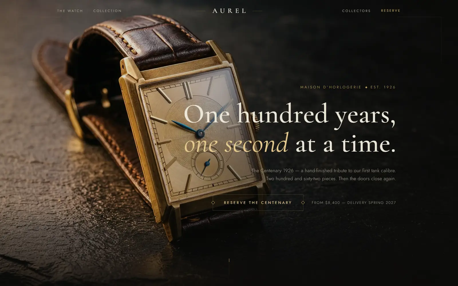
A watch house sells patience and material, so the site has to slow a visitor down rather than rush them to a cart.

The AUREL homepage: a gold dress watch on dark slate beside the line 'One hundred years, one second at a time.'
003

AUREL

2026

Luxury / Horlogerie

An old-money watch house — a light-swept hero, scroll-driven chapters, and a seven-reference boutique with filters and quick-look.

CommerceAvailable

(What was decided, and why)

01

Chapters, not a single scroll

The story of the house is broken into scroll-driven chapters with real pauses between them, mirroring how a boutique actually walks a customer through a collection rather than presenting everything on one shelf.

Scroll the live site slowly and watch each chapter settle before the next begins.

02

Seven references is the whole boutique

The catalogue is deliberately small — seven watches, with filters and a quick-look — because a shop with three hundred items reads as inventory, and a shop with seven reads as a collection someone chose.

The live boutique’s full catalogue is visible in one filtered view.

03

Light does the selling, not copy

The hero is a light-swept photograph rather than a headline making a claim about craftsmanship — the material is asked to argue for itself.

The live hero has almost no text in the first viewport.

(By the numbers)

Captured live from the actual deployment on 2026-08-26 — Lighthouse scores, not estimates. Re-run it yourself against the live link below and it should read close to this.

Performance
86
Accessibility
100
Best practices
100
SEO
69
LCP 3.5sPage weight 4,410 KiB

Same domain-level noindex explanation as the rest of this catalogue applies to the SEO score here.